


 I feel i have progressed so much from my preliminary task to my final products. i have learnt how to use multiple programmes i had never used before, such as Photoshop-and learned to use the tools in this programme professionlly.


 ature men.


 conventional technique of the model looking straight into the camera, this creates a connection between the model-usually celebrity, and the reader-usually an Average Joe. It gives the illusion the model is looking straight out of the picture of the page and straight at the
  reader, helping the media product to connect with the taget audience on a more personal base. For this reason, many music magazines like the one i have produced, use this kind of cover image.

 multiple conventional features such as keeping the same colour scheme from the cover, this is used in almost all magazines, this technique is used to help the magazine flow. Inspiration i have used to contstuct my contents page has come from the music magazine 'Drummer'. Many music magazines feature photos of the stories in the magzazine on the contents page, as i have done in mine, this would be classed as a conventional feature, it makes the reader want to see whats inside. Interesting and quirky photos make the reader want to read further into the magazine because it catches their attention. on my contents page, i have used several images and merged them to form a background, then featured photos include a screenshot of my doublepage spread which shows what the double page spread will look like, a photo of a uni room, and a feature on The Killers concert. I have used the conventional feature of using contrasting coloured fonts for the page number, titles and sub heading/little insight to whats included. I have also included the date and issue number which is another conventional feature.

 I like this font, which is called Old Thunder, it has been downloaded off http://www.fonts.com/ , it is £23.00 but i have just used a sample so that if i do wish to use it i will purchase it, if i dont then it would have been a waste of £23.00 . I like this font because it is kind of old circus style font, kind of comicy which really suits the style i am trying to produce, and definately suits the main image.
 This font has my mind boggled a bit, i cant decide if i like it or not and would take it into further consideration. I think if i did use it, i would have to fill in the white with black so that the whole letter would be bold. This has also been downloaded off of the internet at http://www.freefonts.com/ .
 This font is very old style comic. It is on photoshop, i do like it though i cant imagine it being my title on my front cover, this is because its too playfull.
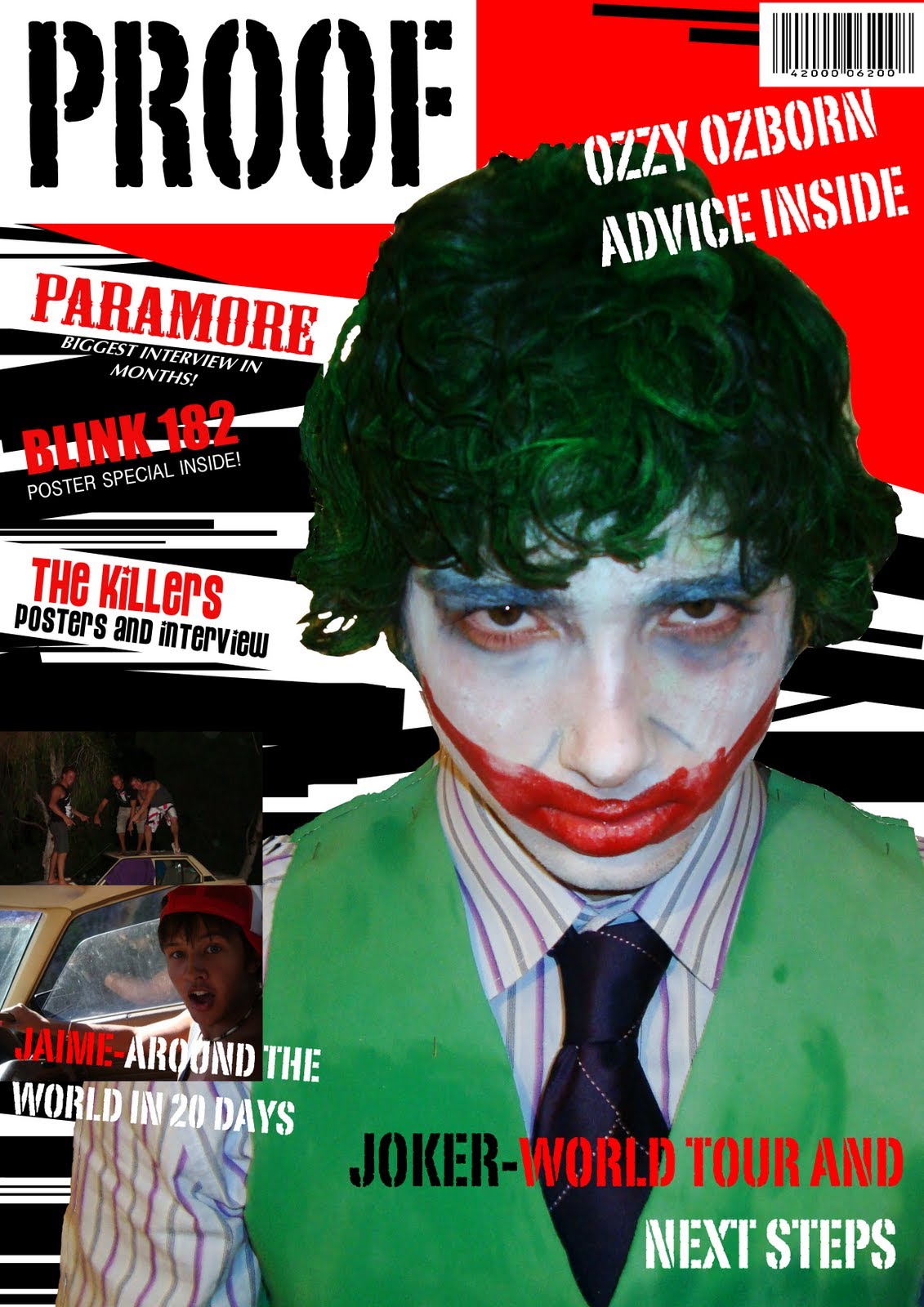
 I have finally found a male model willing to go to the extremes of wearing makeup and dressing up as the joker for me. As there was a lot of preparation to this photo, such as hair and makeup, i asked my friends who fit in with my target market if they would come and see my model dressed up and look at a couple of sample photos for me to tell me what they think. They were very impressed and made it obvious that this is the style of image they would like to see
  on a rock/indie/metal magazine. They told me that the way he was looing into the camera really caught their attention and could see this kind of photo on a real magazine-so obviously this really is a convention of a real media product. I have dressed my model stereo-typicaly as The Joker, this is because I want my 'celebrity' to be a well-known artist, not only because he looks like The Joker, but becasue he impersonates him too. It's his personality. I think i have got the hair, makeup and clothing to a T and will definately be using one of the photos I have taken today on my front cover.
 I have used my sister here to give me a pose which has no pose. This is a convention of a real media product, it has he looking directly into the camera, showing depth and the illusion she is looking through the magazine right into the audience's eyes. I do like this photo, though with feedback form y target audience, I have realised that using a female model just isn't what they want. I have yet to find another male model to volunteer to star on my front cover. Thoug
 h, my target audience did like the convention of my model looking stragiht into the camera. I will definaltely be using this technique in my final photo. The lighting here is good, however i think this is mainly to do with the fact that the quality of the flash ad camera, itself is very good as it is a very expensive camera used from school. I have realised that the quality in pictures differs when using more expensive, technical cameras.
 After asking my target audience what they think of this 2ndphoto I am sure i am not going to take this image further by using the model again or the style of this photo. with my friends opinions and my own, i have come to the conclusion that this photo is too 'pretty' for the genre of music magazine i am going for, this photo will just not attract the audience i am looking for and the photo has no personality to it or 'pazaz', as one of my friends who fits in my target audience told me. I now am going to stick away from photos with outdoor lighting and high white balances. I have now to take some photos with darker balances, maybe using black and white or taking photos in a dark room with a good quality flash. i am quite adament on my main photo for my cover to be quirky, eye-catching and intresting so that my audience will want to read more into the magazine.
 The photo quality isn't great, but i am not too botherd as this photo was only a sample to what i may have used. if i did use this photo i would place my model on a plain background on a flat wall, not in the corner, this would make it easier to crop.


 This snap is kind of like the 1st one, though the lighting is much brighter-which i actuslly prefer, and it is slightly further away, which means more of the guitair is shown. The contrast of the black and white panels on the guitair are more highlighted in this photo because of the better quality flash.
 The structure of this photo will be used in my contents page. Though the quality is bad and also the lighting. I like the style of this photo because its just simple, the contents page photos in my magazine don't need to be interesting as such as the layout will be quite interesting and quirky. Also because of the lighting, which is just natural sunlight, the colours of the props look very faint and boring.
 This is Kara, she is an example of my target audience. She is 19 and currently interested in fashion photography and partying. Her types of friends include boys in bands and her best friend Jolie, is the lead singer in a band 'Pulp'. She currently lives in the inner city of London with her best friend in a studio apartment, where she has lived for 7 months. She took an art and photography course at LCF but unfortunately quite due to plagiarism in the first term she had to leave. Her parents weren't happy about this but let her stay at her apartment to focus on photography, her parents have never been really concerned about her well being as such as they both work full time for major companies and never had time for her, this was upsetting for her growing up and probably caused her to want to be different in the sense of style and personality. She likes to shop in Topshop, though she will only shop in the boutiques as she hates to be seen in something some one else is wearing. She occasionally shops in charity shops and when she does she isn't embarrassed. She wears heavy makeup when going out at night time, but sticks to casual rock chick makeup during the day.
 Maslow's hierarchy of needs is a theory in psychology, proposed by Abraham Maslow in his 1943 paper 'A Theory of Human Motivation'. He created it to show human innate curiosity. It is shaped as a basic pyramid, with a standard wide base at the bottom, representing basic human needs such as food and water, and towards the top showing human self actualization and the ability to be individual. The lower four layers of the pyramid contain what Maslow called the 'deficiency needs' if these needs are not met the body gives no physical indication. Most of media advertisiting is based around this. This gives us as the audience what we need which is shown by the top three sections of the pyrmid, shwoing that if whatever were looking at looks creative and not broing showing us that we need something busy and creative to find it remotly intresting.This has been copied from wikipedia.


 The wording on this magazine is very simple, the main word is ROCKS as it is in big red font witch takes up the whole bottom line of the page so this catches the readers eye and especially because it is in red it draws them in. The colour gives the feel of the magazine and links with its genre, it gives us an insight also into what is in the magazine. The strap across the is in different font so that it stands out, it is on a plain black background with white writing also so that it stands out. It is mearly advertising the magazine.
 the skyline at the top of the page stands out in red, with white writing a rhetorical question asking the readers if Blue is back together? This would draw the reader in, it is used as a type of anchor. The answer in black font, both these lines are in black and white against the red bacground to stand out to catch the readers eye. to the right, a yellow splash showing V-Festival logo catching attention music festival fans, telling us that they know the full line up, and telling us the page to go to to see. this would make us feel like we have back stage knowledge.
With her band members behind her, looking over her shoulder, this is like they are backing her up. Heading-main title, center of the page, infront of the photo is big bold letters, in white outlined in black to make it stand out and look bigger. The subheading, hanlf in red, half in white, to show contrast. The words SEX has been written in red to grab readers attention, could have been below but red is more catchy and also the colour of sex. TV show SKINS is being talked about in the magazine as it says in the subheading, it is also a pun as it is the TV show in which the gossips most famous song, ‘standing in the way of control’. There is a white strap across the page under the subheading, still over the photo, in white, with red loud writing showing what else will be in the interview with the band. In the bottom right hand corner is the barcode, hidden away out of sight, making reader concentrate on the main article and other features. Strap across the bottom, mentioning another band and how their album has been rated. 7 other bands are advertised that there is info about them inside the magazine to grab readers in to read about them.
Along the left side of the front cover is the other featured stories. The first one is clearly MUSE, on a red background, white writing has been used to stand out and to make the writing look bigger than it actually is, it has been embossed in black.
