Throughout my music magazine [front cover, contents and double page spread] i have used many conventions and also challenged some. Starting off with my front cover, i have used the
 conventional technique of the model looking straight into the camera, this creates a connection between the model-usually celebrity, and the reader-usually an Average Joe. It gives the illusion the model is looking straight out of the picture of the page and straight at the
  reader, helping the media product to connect with the taget audience on a more personal base. For this reason, many music magazines like the one i have produced, use this kind of cover image.
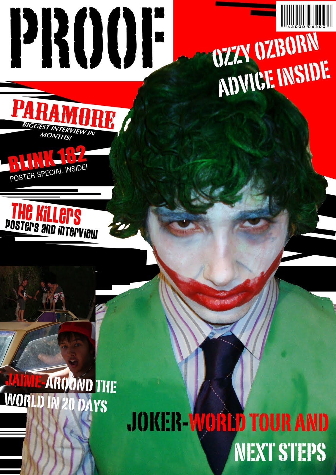
Like most magazines, the title of my magazine is at the top in a font which stands out. Here is a link to my analysis of my title fonts and why i used the one i have. One of the conventions i have used it for the main photo to overlap the title. I havent used this convetion to the maximum...but i have used it in a way i can compare it to a real media product. I have overlapped the block behind the title, just like this Q magazine cover i have found of google. So i class this as a conventional thing. https://blogger.googleusercontent.com/img/b/R29vZ2xl/AVvXsEgEdtFhJLqoibqxBFYKFApd2mmhNyjIIqlow-DqY8w-zG3O-QLS4C0nAgcLuUE24xcqcAi4HLTxXEzdQZtRAw-0ilBPOERw-3lCvSt7N2wjlGAfcheGTZXCUDBua2_i2VXNbYUMH9P_wvI/s1600/PROOF.jpghfDeHHhoI/AAAAAAAAAEo/ClhI0nxEhG8/s1600/PROOF.jpghfDeHHhoI/AAAAAAAAAEo/ClhI0nxEhG8/s1600/PROOF.jpg
Other conventional features i have chosen to include on my magazine front cover include a barcode and other pictures featured inside. I would say on my front cover i have challenged the forms and features of conventional products as i decided with the image i have, some things like a conventional a strapline would confuse my front cover and make it very in your face. Now looking back and analysing my work, i would say that i would like to have included one more conventional feature into my front cover and that would be to insert a pug, either on the left hand side, half way down the page, or on the top right hand corner, underneath 'ozzy ozborn advice inside', i think this could have made my product more classy and attractive.

My contents page uses
 multiple conventional features such as keeping the same colour scheme from the cover, this is used in almost all magazines, this technique is used to help the magazine flow. Inspiration i have used to contstuct my contents page has come from the music magazine 'Drummer'. Many music magazines feature photos of the stories in the magzazine on the contents page, as i have done in mine, this would be classed as a conventional feature, it makes the reader want to see whats inside. Interesting and quirky photos make the reader want to read further into the magazine because it catches their attention. on my contents page, i have used several images and merged them to form a background, then featured photos include a screenshot of my doublepage spread which shows what the double page spread will look like, a photo of a uni room, and a feature on The Killers concert. I have used the conventional feature of using contrasting coloured fonts for the page number, titles and sub heading/little insight to whats included. I have also included the date and issue number which is another conventional feature.

My double page spread is very conventional, starting with the main background photo, having one very large image dminating the page is very conventional for a double page spread. the background ger was a photo i took when i went to see the killers. i used this to set the tone and layered up more photos and writing to get the effect i was going fr. I used my skills i had improved on to make my model, The Joker, look like he is actually singing, you can just about see it throgh the middle of the two collums on the right hand side. Another conventional feature i have used is the big, bold headline at the top. again, i have stuck with the same colours throughout the magazine to keep it flowing from page to page, and also the same font for headlines. One thing i have just realised i have forgotten whilst annalysing my double page spread, is i have wanted to through out my design work and production, i wanted to put a quote on the left hand side. i am very annoyed that i have forgotten this one thing. so technically, i have challenged the convention. joker playing cards and faces have been incorporated into the double page spread to set the tone and give the impression of laughter, risk, and games. I feel the page is well layed out and gives the overall appearance of a real media product. the layout is very conventional whch makes it look professional. One other convetional feature i have realised i have used is that there are no black/mixed race people in my magazine, this is becasue when researching magazines, i didnt see any black people in current existing media products. This would be because black people are more assocciated with rap and hip-hop and i so have chosen to not include any black people in my media product, this is becasue i felt if i did i would be confusing what my actual genre was.

No comments:
Post a Comment