Thursday, 22 April 2010

Title-Proof-font ideas

Here are the fonts i am testing out to use on my final media product [front cover].


I like this font, which is called Old Thunder, it has been downloaded off http://www.fonts.com/ , it is £23.00 but i have just used a sample so that if i do wish to use it i will purchase it, if i dont then it would have been a waste of £23.00 . I like this font because it is kind of old circus style font, kind of comicy which really suits the style i am trying to produce, and definately suits the main image.


This font has my mind boggled a bit, i cant decide if i like it or not and would take it into further consideration. I think if i did use it, i would have to fill in the white with black so that the whole letter would be bold. This has also been downloaded off of the internet at http://www.freefonts.com/ .


This font is very old style comic. It is on photoshop, i do like it though i cant imagine it being my title on my front cover, this is because its too playfull.


I really like this font, it is called Portagol on Photoshop Elements. It's like a stamp you get on evidence bags in a courtroom, or print you get on boxes when in the army/ on explosives. I think i am definately going to be using this font for my title on my front cover. It really stands out.

Wednesday, 21 April 2010

Title ideas

My music magazine is aimed at individual, quirky people, with this, my magazine title needs to reflect it and be memorable, punchy and fun!


I have listed some ideas of what i think i might incorporate into my product. i will also base one of my questions on my questionaire about the title.


Fallen

Encore

DWI-Down With It

Base

Proof

Sound


Fallen-I dont why i chose this as an idea for my magzine title, it kind of sprung to mind and i liked it, to be honest, i'm not too keen on this idea now and definately wont't be using it in my final product.


Encore-Encore means a demand by an audience for an additional performance. This would be a good way of getting the reader to want to read the magazine, its like they want more. This would be a very good title for my target audience.


DWI-This is an acronym for 'Down With It', this means that someone is on trend/in the crowd really. Using this as a title for a music magazine would tell the readers that the magazine they are reading is down with the music, latest gossip, artists and music. It would in effect make them feel on trend, knowledgeable of current gossips and news about music and make them want to buy the magazine in the future so they are always in the know.


Base-Base obviously means a beat in a musical piece. The base, without it, the music woudlnt be there. Using this as the title for my magazine would tell the reader that without this music magzine-there would be no music, nothing to write about. This title is very memorable, as it is punchy and bold. I really like this title, it is definately a candidate for my magazine.


Proof-Proof means 'the evidence to show that something is true, or win an argument.' Proof being my title, would mean that everything inside the magazine, would efficiently, be truth. This would tell the reader that they can guarentee no lies, just news and truth. It is quite a punchy title which is good, it would stay in the readers mind, so if bought again, it can easily be remebered. I think this may be a candidate for the title of my magazine.


Sound-Is one of the 5 senses, it is what makes music a possible thing. It being the title for my music magazine, would efficiently describe the acual reason for the magazine itself. I do like this title though it seems a bit dull and un-orignal to me. I dont't think i will be incorporating this title in my magazine.

Monday, 19 April 2010

Sample photo for front cover 4

I have finally found a male model willing to go to the extremes of wearing makeup and dressing up as the joker for me. As there was a lot of preparation to this photo, such as hair and makeup, i asked my friends who fit in with my target market if they would come and see my model dressed up and look at a couple of sample photos for me to tell me what they think. They were very impressed and made it obvious that this is the style of image they would like to see on a rock/indie/metal magazine. They told me that the way he was looing into the camera really caught their attention and could see this kind of photo on a real magazine-so obviously this really is a convention of a real media product. I have dressed my model stereo-typicaly as The Joker, this is because I want my 'celebrity' to be a well-known artist, not only because he looks like The Joker, but becasue he impersonates him too. It's his personality. I think i have got the hair, makeup and clothing to a T and will definately be using one of the photos I have taken today on my front cover.

Wednesday, 14 April 2010

Sample photo for front cover 3

I have used my sister here to give me a pose which has no pose. This is a convention of a real media product, it has he looking directly into the camera, showing depth and the illusion she is looking through the magazine right into the audience's eyes. I do like this photo, though with feedback form y target audience, I have realised that using a female model just isn't what they want. I have yet to find another male model to volunteer to star on my front cover. Though, my target audience did like the convention of my model looking stragiht into the camera. I will definaltely be using this technique in my final photo. The lighting here is good, however i think this is mainly to do with the fact that the quality of the flash ad camera, itself is very good as it is a very expensive camera used from school. I have realised that the quality in pictures differs when using more expensive, technical cameras.

Sunday, 11 April 2010

Sample photo for front cover 2

After asking my target audience what they think of this 2ndphoto I am sure i am not going to take this image further by using the model again or the style of this photo. with my friends opinions and my own, i have come to the conclusion that this photo is too 'pretty' for the genre of music magazine i am going for, this photo will just not attract the audience i am looking for and the photo has no personality to it or 'pazaz', as one of my friends who fits in my target audience told me. I now am going to stick away from photos with outdoor lighting and high white balances. I have now to take some photos with darker balances, maybe using black and white or taking photos in a dark room with a good quality flash. i am quite adament on my main photo for my cover to be quirky, eye-catching and intresting so that my audience will want to read more into the magazine.

Saturday, 10 April 2010

Sample photo for front cover 1

This is one of my first shots to be used on the front cover, I have gone for a standard indie pose-guitair in hand, bent down looking away from the camera, originally i wanted something like this, though once asking friends who fitted in my target audience, i realised using this kind of imagery wouldnt stand out to them.i showed them a range of other photos i had taken and asked them which one caught their eye most, and which one they would rather read about in a double page spread. The photo quality isn't great, but i am not too botherd as this photo was only a sample to what i may have used. if i did use this photo i would place my model on a plain background on a flat wall, not in the corner, this would make it easier to crop.

Tuesday, 6 April 2010

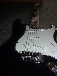
Photo ideas of guitair for contents.

This first photo of the guitairs is taken from a low anlge, making

the gutair look like it has power and a vast amount of significance. I like the lighting i have captured for this photo, the natural lighting was quite dim, and so i used the flash on my camera which is an ordinary flash. It gives the illusion that the keys at the end of the long bit are far away and the guitair is very long, and it makes the big bit of the guitair-the main bit, look vry powerfull and demanding.


I really do adore the lighting of this photo, as unlike the previous one above, sunlight from a window behind the wadrobe i have stood the guitair against, is shining onto the guitair in this photo as i have placed it differently, in this shot it is lying flat on the ground, with the tip of it pointing at the sunlight.


This snap is kind of like the 1st one, though the lighting is much brighter-which i actuslly prefer, and it is slightly further away, which means more of the guitair is shown. The contrast of the black and white panels on the guitair are more highlighted in this photo because of the better quality flash.
Check Spelling